
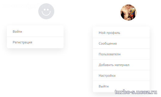
Выпадающее меню профиля
Выпадающее меню профиля-итак сегодня вашему вниманию представляется такое выпадающее меню пользователя,которое позволит вам разместить этот профиль с этой менюшкой в свободное место,где мало места и не поместятся иные мини-профили
Установка:
В то самое место,куда не поместятся другие профили
Это в CSS
Установка:
В то самое место,куда не поместятся другие профили
Код
<nav>
<ul>
<li class="drop">
<div class="user-avatar">
<img src="http://www.stedesign.com/ste.png" />
</div>
<a href="#">Stefano</a>
<span aria-hidden="true" class="icon-reorder orange-txt"></span>
<div class="triangle"></div>
<div class="dropdownContain">
<div class="dropOut">
<ul>
<li><span aria-hidden="true" class="icon-envelope-alt"></span> Messaggi</li>
<li><span aria-hidden="true" class="icon-user"></span> Mio Profilo</li>
<li><span aria-hidden="true" class="icon-cog"></span> Impostazioni</li>
<li><span aria-hidden="true" class="icon-off"></span> Log Out</li>
</ul>
</div>
</div>
</li>
</ul>
</nav>
<ul>
<li class="drop">
<div class="user-avatar">
<img src="http://www.stedesign.com/ste.png" />
</div>
<a href="#">Stefano</a>
<span aria-hidden="true" class="icon-reorder orange-txt"></span>
<div class="triangle"></div>
<div class="dropdownContain">
<div class="dropOut">
<ul>
<li><span aria-hidden="true" class="icon-envelope-alt"></span> Messaggi</li>
<li><span aria-hidden="true" class="icon-user"></span> Mio Profilo</li>
<li><span aria-hidden="true" class="icon-cog"></span> Impostazioni</li>
<li><span aria-hidden="true" class="icon-off"></span> Log Out</li>
</ul>
</div>
</div>
</li>
</ul>
</nav>
Это в CSS
Код
nav {
width:13em;
margin:2em auto;
background:#f6f6f6;
@include border-radius(.4em, .4em);
box-shadow: 0 0 4px rgba(0,0,0,.15);
}
.user-avatar img{
@include border-radius(4em,4em);
float:left;
margin-left:.618em;
margin-top:.2em
}
.icon-reorder{
padding:.8em 1em;
color:white;
border-radius:0 .4em .4em 0;
float:right
}
.drop {
position: relative;
font-size: 1em;
cursor: pointer;
a {
font-weight: 400;
line-height: 2.5em;
padding: 0 1em;
color: lighten(black,30%);
text-decoration:none;
}
}
.triangle {
width: 0;
height: 0;
position: absolute;
border-left: .4em solid transparent;
border-right: .4em solid transparent;
border-top: .4em solid #FFB135;
left: 89.5%;
margin-left: -.4em;
opacity:0
}
.dropdownContain {
width: 13em;
position: absolute;
z-index: 2;
left: 50%;
margin-left: -6.5em; /* half of width */
top: -300px;
}
.dropOut {
width: 13em;
background:#f6f6f6;
float: left;
position: relative;
margin-top: 0;
opacity: 0;
@include border-radius(.4em, .4em);
box-shadow: 0 0 4px rgba(0,0,0,.15);
border:1px solid rgba(white, .75) ;
overflow:hidden;
-webkit-transition: all 0.1s ease-out;
-moz-transition: all 0.1s ease-out;
-ms-transition: all 0.1s ease-out;
-o-transition: all 0.1s ease-out;
transition: all 0.1s ease-out;
ul {
padding: .3em 0;
margin:0
}
}
.dropOut li {
text-align: left;
width: 100%;
padding: .6em 0 ;
color: darken(#fff, 50%);
border-left:3px solid #f7f7f7;
-webkit-transition: all 0.1s ease-out;
-moz-transition: all 0.1s ease-out;
-ms-transition: all 0.1s ease-out;
-o-transition: all 0.1s ease-out;
transition: all 0.1s ease-out;
span{
color: darken(#fff, 20%);
margin: 0 1.5em 0 .8em;
}
&:hover{
border-color: lighten(#FFB135,10%);
color: darken(#fff, 70%);
background: darken(#f7f7f7,4%);
span{
color:darken(#fff, 50%)
}
}
}
ul li:hover .triangle { opacity: 1 }
ul li:hover .dropdownContain { top: 30px; }
ul li:hover .dropOut { opacity: 1; margin-top:20px;}
.orange-txt {
background-color: #ffc15e;
background-image: -o-linear-gradient(bottom, #ffb135 0%, #ffc15e 100%);
background-image: -moz-linear-gradient(bottom, #ffb135 0%, #ffc15e 100%);
background-image: -webkit-linear-gradient(bottom, #ffb135 0%, #ffc15e 100%);
background-image: -ms-linear-gradient(bottom, #ffb135 0%, #ffc15e 100%);
background-image: -webkit-gradient(linear, left bottom, left top, color-stop(0%, #ffb135), color-stop(100%, #ffc15e));
background-image: linear, bottom, #ffb135 0%, #ffc15e 100%;
&:hover {
background: #ffb135;
}
}
Файлы для скачивания отсутствуют.
Поблагодарить автора
Автор: Turbo
Комментарии (0)