
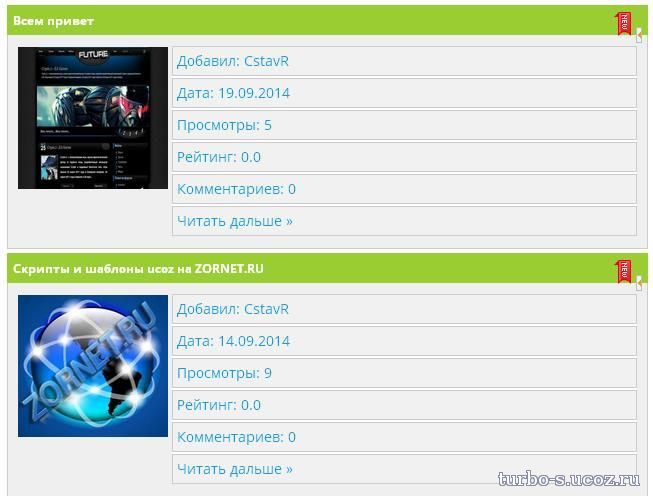
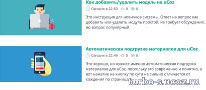
Адаптивный вид материалов для каталогов сайта
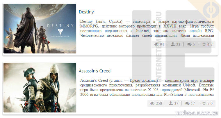
Адаптивный вид материалов для каталогов сайта-выглядит привлекательным и компактным видом материалов,так что для тех вебмастеров кто ценит компактность и малообьемность предлагается такой вид материалов.Такой вид при наведении на который можно увидеть эффект,появления затемнения с описанием к материалу
Установка:В вид материалов
В CSS
Установка:В вид материалов
Код
<div class="block-type">
<div class="hover-effect">
<div class="img-type" style="background-image: url('$IMG_URL1$')">
<div class="caption">
<?if($MODER_PANEL$)?><div style="float:right">$MODER_PANEL$</div><?endif?>
<h4>$TITLE$</h4>
<p><?substr($MESSAGE$,0,150)?> ...</p>
<a class="btn" href="$ENTRY_URL$" title="Подробнее">Подробнее</a>
</div>
</div>
</div>
</div>
В CSS
Код
.block-type {
width:48%;
float:left;
margin: 1%;
}
.img-type {
z-index:1;
border: 1px solid #363636;
border-radius: 5px;
display: block;
position: relative;
margin: 0;
padding-bottom: 56.25%;
padding-top: 30px;
height: 0;
overflow: hidden;
background-size: 100% 100%;
-moz-background-size: 100% 100%;
-moz-box-shadow:0 5px 5px #000;
box-shadow:0 5px 5px #000;
-webkit-box-shadow:0 5px 5px #000;
}
.hover-effect {
position: relative;
}
.hover-effect img {
width: 100%;
height: 100%;
}
.hover-effect .caption {
position: absolute;
top: 0;
left: 0px;
background: rgba(0,0,0,0.7);
width: 100%;
height: 100%;
color: #FFFFFF;
opacity: 0;
-o-transition: all 0.2s linear 0s;
-moz-transition: all 0.2s linear 0s;
-webkit-transition: all 0.2s linear 0s;
-ms-transition: all 0.2s linear 0s;
transition: all 0.2s linear 0s;
}
.hover-effect .caption h4 {
font-size: 14px;
font-weight: 700;
text-transform: uppercase;
text-align: center;
border-bottom: 1px solid gray;
padding-bottom: 5px;
margin: 5px;
-webkit-transform: scale(0.25);
-moz-transform: scale(0.25);
-ms-transform: scale(0.25);
-o-transform: scale(0.25);
transform: scale(0.25);
-o-transition: all 0.3s linear 0s;
-moz-transition: all 0.3s linear 0s;
-webkit-transition: all 0.3s linear 0s;
-ms-transition: all 0.3s linear 0s;
transition: all 0.3s linear 0s;
}
.hover-effect .caption p {
margin: 5px;
padding: 5px;
text-align: left;
-webkit-transform: scale(0.25);
-moz-transform: scale(0.25);
-ms-transform: scale(0.25);
-o-transform: scale(0.25);
transform: scale(0.25);
-o-transition: all 0.3s linear 0s;
-moz-transition: all 0.3s linear 0s;
-webkit-transition: all 0.3s linear 0s;
-ms-transition: all 0.3s linear 0s;
transition: all 0.3s linear 0s;
}
.hover-effect .caption a.btn {
width: 80px;
text-align: center;
display: block;
background: #68432d;
color: #FFFFFF;
padding: 2px 5px;
border-radius: 5px;
margin: 0px auto 0px auto;
-webkit-transform: scale(0.25);
-moz-transform: scale(0.25);
-ms-transform: scale(0.25);
-o-transform: scale(0.25);
transform: scale(0.25);
-o-transition: all 0.3s linear 0s;
-moz-transition: all 0.3s linear 0s;
-webkit-transition: all 0.3s linear 0s;
-ms-transition: all 0.3s linear 0s;
transition: all 0.3s linear 0s;
}
.hover-effect:hover .caption {
opacity: 1;
}
.hover-effect:hover .caption h4,
.hover-effect:hover .caption p,
.hover-effect:hover .caption a.btn {
-webkit-transform: scale(1);
-moz-transform: scale(1);
-ms-transform: scale(1);
-o-transform: scale(1);
transform: scale(1);
}
@media screen and (min-width:240px) and (max-width:480px) {
.block-type {width:98%;float:none;}
}
Файлы для скачивания отсутствуют.
Поблагодарить автора
Автор: Turbo
Комментарии (0)