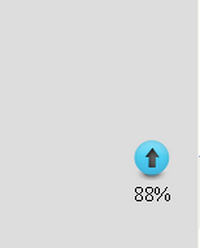
Стильный Progress bar для сайта на Js и CSS
Стильный Progress bar для сайта на Js и CSS-какой бы вы сайт не создали бы легкий и быстрый или тяжелый и долго прогружаемый он все равно будет в мониторе пользователе какое то время оставаться экраном загрузки,а что бы этот экран не показался скучным предлагаю добавить такой прогресс бар,который покажет степень загрузки чего-либо.Или же такой скрипт можно поставить на флеш-плеер который покажет сколько времени осталось до истечении времени рекламы если она есть
Установка:CSS
Место расположения прогресс бара
Перед закрывающимся тегом /body
Установка:CSS
Код
.progress-bar {
background-color: none;
height: 24px;
padding: 2.5px;
width: 35%; /* 130px */
margin: 7px 0 2px 0;
-moz-border-radius: 5px;
-webkit-border-radius: 5px;
border-radius: 5px;
-moz-box-shadow: 0 1px 5px #000 inset, 0 1px 0 #444;
-webkit-box-shadow: 0 1px 5px #000 inset, 0 1px 0 #444;
box-shadow: 0 1px 5px #000 inset, 0 1px 0 #444;
}
.progress-bar span {
display: inline-block;
height: 100%;
background-color: #777;
-moz-border-radius: 3px;
-webkit-border-radius: 3px;
border-radius: 3px;
-moz-box-shadow: 0 1px 0 rgba(255, 255, 255, .5) inset;
-webkit-box-shadow: 0 1px 0 rgba(255, 255, 255, .5) inset;
box-shadow: 0 1px 0 rgba(255, 255, 255, .5) inset;
-webkit-transition: width .4s ease-in-out;
-moz-transition: width .4s ease-in-out;
-ms-transition: width .4s ease-in-out;
-o-transition: width .4s ease-in-out;
transition: width .4s ease-in-out;
}
/*---------------------------*/
.blue span {
background-color: #34c2e3;
}
.orange span {
background-color: #fecf23;
background-image: -webkit-gradient(linear, left top, left bottom, from(#fecf23), to(#fd9215));
background-image: -webkit-linear-gradient(top, #fecf23, #fd9215);
background-image: -moz-linear-gradient(top, #fecf23, #fd9215);
background-image: -ms-linear-gradient(top, #fecf23, #fd9215);
background-image: -o-linear-gradient(top, #fecf23, #fd9215);
background-image: linear-gradient(top, #fecf23, #fd9215);
}
.green span {
background-color: #a5df41;
background-image: -webkit-gradient(linear, left top, left bottom, from(#a5df41), to(#4ca916));
background-image: -webkit-linear-gradient(top, #a5df41, #4ca916);
background-image: -moz-linear-gradient(top, #a5df41, #4ca916);
background-image: -ms-linear-gradient(top, #a5df41, #4ca916);
background-image: -o-linear-gradient(top, #a5df41, #4ca916);
background-image: linear-gradient(top, #a5df41, #4ca916);
}
/*---------------------------*/
.stripes span {
-webkit-background-size: 30px 30px;
-moz-background-size: 30px 30px;
background-size: 30px 30px;
background-image: -webkit-gradient(linear, left top, right bottom,
color-stop(.25, rgba(255, 255, 255, .15)), color-stop(.25, transparent),
color-stop(.5, transparent), color-stop(.5, rgba(255, 255, 255, .15)),
color-stop(.75, rgba(255, 255, 255, .15)), color-stop(.75, transparent),
to(transparent));
background-image: -webkit-linear-gradient(135deg, rgba(255, 255, 255, .15) 25%, transparent 25%,
transparent 50%, rgba(255, 255, 255, .15) 50%, rgba(255, 255, 255, .15) 75%,
transparent 75%, transparent);
background-image: -moz-linear-gradient(135deg, rgba(255, 255, 255, .15) 25%, transparent 25%,
transparent 50%, rgba(255, 255, 255, .15) 50%, rgba(255, 255, 255, .15) 75%,
transparent 75%, transparent);
background-image: -ms-linear-gradient(135deg, rgba(255, 255, 255, .15) 25%, transparent 25%,
transparent 50%, rgba(255, 255, 255, .15) 50%, rgba(255, 255, 255, .15) 75%,
transparent 75%, transparent);
background-image: -o-linear-gradient(135deg, rgba(255, 255, 255, .15) 25%, transparent 25%,
transparent 50%, rgba(255, 255, 255, .15) 50%, rgba(255, 255, 255, .15) 75%,
transparent 75%, transparent);
background-image: linear-gradient(135deg, rgba(255, 255, 255, .15) 25%, transparent 25%,
transparent 50%, rgba(255, 255, 255, .15) 50%, rgba(255, 255, 255, .15) 75%,
transparent 75%, transparent);
-webkit-animation: animate-stripes 3s linear infinite;
-moz-animation: animate-stripes 3s linear infinite;
}
@-webkit-keyframes animate-stripes {
0% {background-position: 0 0;} 100% {background-position: 60px 0;}
}
@-moz-keyframes animate-stripes {
0% {background-position: 0 0;} 100% {background-position: 60px 0;}
}
/*---------------------------*/
.shine span {
position: relative;
}
.shine span::after {
content: '';
opacity: 0;
position: absolute;
top: 0;
right: 0;
bottom: 0;
left: 0;
background: #fff;
-moz-border-radius: 3px;
-webkit-border-radius: 3px;
border-radius: 3px;
-webkit-animation: animate-shine 2s ease-out infinite;
-moz-animation: animate-shine 2s ease-out infinite;
}
@-webkit-keyframes animate-shine {
0% {opacity: 0; width: 0;}
50% {opacity: .5;}
100% {opacity: 0; width: 95%;}
}
@-moz-keyframes animate-shine {
0% {opacity: 0; width: 0;}
50% {opacity: .5;}
100% {opacity: 0; width: 95%;}
}
/*---------------------------*/
.glow span {
-moz-box-shadow: 0 5px 5px rgba(255, 255, 255, .7) inset, 0 -5px 5px rgba(255, 255, 255, .7) inset;
-webkit-box-shadow: 0 5px 5px rgba(255, 255, 255, .7) inset, 0 -5px 5px rgba(255, 255, 255, .7) inset;
box-shadow: 0 5px 5px rgba(255, 255, 255, .7) inset, 0 -5px 5px rgba(255, 255, 255, .7) inset;
-webkit-animation: animate-glow 1s ease-out infinite;
-moz-animation: animate-glow 1s ease-out infinite;
}
@-webkit-keyframes animate-glow {
0% { -webkit-box-shadow: 0 5px 5px rgba(255, 255, 255, .7) inset, 0 -5px 5px rgba(255, 255, 255, .7) inset;}
50% { -webkit-box-shadow: 0 5px 5px rgba(255, 255, 255, .3) inset, 0 -5px 5px rgba(255, 255, 255, .3) inset;}
100% { -webkit-box-shadow: 0 5px 5px rgba(255, 255, 255, .7) inset, 0 -5px 5px rgba(255, 255, 255, .7) inset;}
}
@-moz-keyframes animate-glow {
0% { -moz-box-shadow: 0 5px 5px rgba(255, 255, 255, .7) inset, 0 -5px 5px rgba(255, 255, 255, .7) inset;}
50% { -moz-box-shadow: 0 5px 5px rgba(255, 255, 255, .3) inset, 0 -5px 5px rgba(255, 255, 255, .3) inset;}
100% { -moz-box-shadow: 0 5px 5px rgba(255, 255, 255, .7) inset, 0 -5px 5px rgba(255, 255, 255, .7) inset;}
}
Место расположения прогресс бара
Код
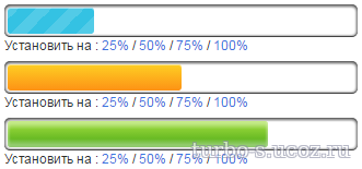
<div class="progress-bar blue stripes"><span style="width: 40%"></span></div>
<p>Установить на :
<a href="#" class="quarter">25%</a> /
<a href="#" class="half">50%</a> /
<a href="#" class="three-quarters">75%</a> /
<a href="#" class="full">100%</a>
</p>
<div class="progress-bar orange shine"> <span style="width: 65%"></span></div>
<p>Установить на :
<a href="#" class="quarter">25%</a> /
<a href="#" class="half">50%</a> /
<a href="#" class="three-quarters">75%</a> /
<a href="#" class="full">100%</a>
</p>
<div class="progress-bar green glow"> <span style="width: 55%"></span></div>
<p>Установить на :
<a href="#" class="quarter">25%</a> /
<a href="#" class="half">50%</a> /
<a href="#" class="three-quarters">75%</a> /
<a href="#" class="full">100%</a>
</p>
<p>Установить на :
<a href="#" class="quarter">25%</a> /
<a href="#" class="half">50%</a> /
<a href="#" class="three-quarters">75%</a> /
<a href="#" class="full">100%</a>
</p>
<div class="progress-bar orange shine"> <span style="width: 65%"></span></div>
<p>Установить на :
<a href="#" class="quarter">25%</a> /
<a href="#" class="half">50%</a> /
<a href="#" class="three-quarters">75%</a> /
<a href="#" class="full">100%</a>
</p>
<div class="progress-bar green glow"> <span style="width: 55%"></span></div>
<p>Установить на :
<a href="#" class="quarter">25%</a> /
<a href="#" class="half">50%</a> /
<a href="#" class="three-quarters">75%</a> /
<a href="#" class="full">100%</a>
</p>
Перед закрывающимся тегом /body
Код
<script>$(document).ready(function(){
$('.quarter').click(function(){
$(this).parent().prev().children('span').css('width','25%');
});
$('.half').click(function(){
$(this).parent().prev().children('span').css('width','50%');
});
$('.three-quarters').click(function(){
$(this).parent().prev().children('span').css('width','75%');
});
$('.full').click(function(){
$(this).parent().prev().children('span').css('width','100%');
});
});</script>
Файлы для скачивания отсутствуют.
Поблагодарить автора
Автор: Turbo
ДемонстрацияВизуальное демонстрирование
Комментарии (0)