FACEBOOK EMOJI НА CSS
Описание:
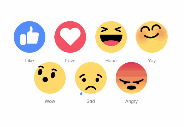
Хотите использовать в своих проектах вид смайлов как на Facebook, тогда думаю что этот материал вам понравится. Дело в том, что все предоставленные смайлы были написаны и созданы с применением HTML и CSS. Вам будет легко делать свои правки и любые изменения в css файле под свои нужды. Все смайлы анимированные, что добавляет красивый визуальный эффект для их отображения в проектах.
Установка:
HTML
Нам нужно вставить стили, которые будут отвечать за их вид и эмоции. Приведенный ниже код уже готов для вставки на странице, но чтобы не вставлять такой большой код, вы можете вынести его в отдельный файл (например: emoji.css) и подключить его к странице указав путь файла. Например:
Вот и сам CSS стили
Вот и всё!
Turbo-S - Если будет вопросы пишите в комментариях, Если нужен помощь по установке тогда создайте тему форуме.
Хотите использовать в своих проектах вид смайлов как на Facebook, тогда думаю что этот материал вам понравится. Дело в том, что все предоставленные смайлы были написаны и созданы с применением HTML и CSS. Вам будет легко делать свои правки и любые изменения в css файле под свои нужды. Все смайлы анимированные, что добавляет красивый визуальный эффект для их отображения в проектах.
Установка:
HTML
Код
<div class="emoji emoji--like">
<div class="emoji__hand">
<div class="emoji__thumb"></div>
</div>
</div>
<div class="emoji emoji--love">
<div class="emoji__heart"></div>
</div>
<div class="emoji emoji--haha">
<div class="emoji__face">
<div class="emoji__eyes"></div>
<div class="emoji__mouth">
<div class="emoji__tongue"></div>
</div>
</div>
</div>
<div class="emoji emoji--yay">
<div class="emoji__face">
<div class="emoji__eyebrows"></div>
<div class="emoji__mouth"></div>
</div>
</div>
<div class="emoji emoji--wow">
<div class="emoji__face">
<div class="emoji__eyebrows"></div>
<div class="emoji__eyes"></div>
<div class="emoji__mouth"></div>
</div>
</div>
<div class="emoji emoji--sad">
<div class="emoji__face">
<div class="emoji__eyebrows"></div>
<div class="emoji__eyes"></div>
<div class="emoji__mouth"></div>
</div>
</div>
<div class="emoji emoji--angry">
<div class="emoji__face">
<div class="emoji__eyebrows"></div>
<div class="emoji__eyes"></div>
<div class="emoji__mouth"></div>
</div>
</div>
Нам нужно вставить стили, которые будут отвечать за их вид и эмоции. Приведенный ниже код уже готов для вставки на странице, но чтобы не вставлять такой большой код, вы можете вынести его в отдельный файл (например: emoji.css) и подключить его к странице указав путь файла. Например:
Код
<link type="text/css" rel="stylesheet" href="/css/emoji.css" />
Вот и сам CSS стили
Код
<style class="cp-pen-styles">
body {
text-align: center;
margin: 80px auto 0;
font-family: sans-serif;
}
.emoji {
width: 120px;
height: 120px;
margin: 15px;
background: #FFDA6A;
display: inline-block;
border-radius: 50%;
position: relative;
}
.emoji:after {
position: absolute;
bottom: -40px;
font-size: 18px;
width: 60px;
left: calc(50% - 30px);
color: #8A8A8A;
}
.emoji__face,
.emoji__eyebrows,
.emoji__eyes,
.emoji__mouth,
.emoji__tongue,
.emoji__heart,
.emoji__hand,
.emoji__thumb {
position: absolute;
}
.emoji__face:before,
.emoji__face:after,
.emoji__eyebrows:before,
.emoji__eyebrows:after,
.emoji__eyes:before,
.emoji__eyes:after,
.emoji__mouth:before,
.emoji__mouth:after,
.emoji__tongue:before,
.emoji__tongue:after,
.emoji__heart:before,
.emoji__heart:after,
.emoji__hand:before,
.emoji__hand:after,
.emoji__thumb:before,
.emoji__thumb:after {
position: absolute;
content: '';
}
.emoji__face {
width: inherit;
height: inherit;
}
.emoji--like {
background: #548DFF;
}
.emoji--like:after {
content: 'Like';
}
.emoji--like .emoji__hand {
left: 25px;
bottom: 30px;
width: 20px;
height: 40px;
background: #FFFFFF;
border-radius: 5px;
z-index: 0;
animation: hands-up 2s linear infinite;
}
.emoji--like .emoji__hand:before {
left: 25px;
bottom: 5px;
width: 40px;
background: inherit;
height: 10px;
border-radius: 2px 10px 10px 2px;
box-shadow: 1px -9px 0 1px #FFFFFF, 2px -19px 0 2px #FFFFFF, 3px -29px 0 3px #FFFFFF;
}
.emoji--like .emoji__thumb {
border-bottom: 20px solid #FFFFFF;
border-left: 20px solid transparent;
top: -25px;
right: -25px;
z-index: 2;
transform: rotate(5deg);
transform-origin: 0% 100%;
animation: thumbs-up 2s linear infinite;
}
.emoji--like .emoji__thumb:before {
border-radius: 50% 50% 0 0;
background: #FFFFFF;
width: 10px;
height: 12px;
left: -10px;
top: -8px;
transform: rotate(-15deg);
transform-origin: 100% 100%;
box-shadow: -1px 4px 0 -1px #FFFFFF;
}
.emoji--love {
background: #F55064;
}
.emoji--love:after {
content: 'Love';
}
.emoji--love .emoji__heart {
left: calc(50% - 40px);
top: calc(50% - 40px);
width: 80px;
height: 80px;
animation: heart-beat 1s linear infinite alternate;
}
.emoji--love .emoji__heart:before,
.emoji--love .emoji__heart:after {
left: calc(50% - 20px);
top: calc(50% - 32px);
width: 40px;
height: 64px;
background: #FFFFFF;
border-radius: 20px 20px 0 0;
}
.emoji--love .emoji__heart:before {
transform: translate(20px) rotate(-45deg);
transform-origin: 0 100%;
}
.emoji--love .emoji__heart:after {
transform: translate(-20px) rotate(45deg);
transform-origin: 100% 100%;
}
.emoji--haha:after {
content: 'Haha';
}
.emoji--haha .emoji__face {
animation: haha-face 2s linear infinite;
}
.emoji--haha .emoji__eyes {
width: 26px;
height: 6px;
border-radius: 2px;
left: calc(50% - 13px);
top: 35px;
transform: rotate(20deg);
background: transparent;
box-shadow: -25px 5px 0 0 #000000, 25px -5px 0 0 #000000;
}
.emoji--haha .emoji__eyes:after {
left: 0;
top: 0;
width: 26px;
height: 6px;
border-radius: 2px;
transform: rotate(-40deg);
background: transparent;
box-shadow: -25px -5px 0 0 #000000, 25px 5px 0 0 #000000;
}
.emoji--haha .emoji__mouth {
width: 80px;
height: 40px;
left: calc(50% - 40px);
top: 50%;
background: #000000;
border-radius: 0 0 40px 40px;
overflow: hidden;
z-index: 1;
animation: haha-mouth 2s linear infinite;
}
.emoji--haha .emoji__tongue {
width: 70px;
height: 30px;
background: #F55064;
left: calc(50% - 35px);
bottom: -10px;
border-radius: 50%;
}
.emoji--yay:after {
content: 'Yay';
animation: yay-reverse 1s linear infinite;
}
.emoji--yay .emoji__face {
animation: yay 1s linear infinite alternate;
}
.emoji--yay .emoji__eyebrows {
left: calc(50% - 3px);
top: 30px;
height: 6px;
width: 6px;
border-radius: 50%;
background: transparent;
box-shadow: -6px 0 0 0 #000000, -36px 0 0 0px #000000, 6px 0 0 0 #000000, 36px 0 0 0px #000000;
}
.emoji--yay .emoji__eyebrows:before,
.emoji--yay .emoji__eyebrows:after {
width: 36px;
height: 18px;
border-radius: 60px 60px 0 0;
background: transparent;
border: 6px solid black;
box-sizing: border-box;
border-bottom: 0;
bottom: 3px;
left: calc(50% - 18px);
}
.emoji--yay .emoji__eyebrows:before {
margin-left: -21px;
}
.emoji--yay .emoji__eyebrows:after {
margin-left: 21px;
}
.emoji--yay .emoji__mouth {
top: 60px;
background: transparent;
left: 50%;
}
.emoji--yay .emoji__mouth:after {
width: 80px;
height: 80px;
left: calc(50% - 40px);
top: -75px;
border-radius: 50%;
background: transparent;
border: 6px solid #000000;
box-sizing: border-box;
border-top-color: transparent;
border-left-color: transparent;
border-right-color: transparent;
z-index: 1;
}
.emoji--yay .emoji__mouth:before {
width: 6px;
height: 6px;
background: transparent;
border-radius: 50%;
bottom: 5px;
left: calc(50% - 3px);
box-shadow: -25px 0 0 0 #000000, 25px 0 0 0 #000000, -35px -2px 30px 10px #D5234C, 35px -2px 30px 10px #D5234C;
}
.emoji--wow:after {
content: 'Wow';
}
.emoji--wow .emoji__face {
animation: wow-face 3s linear infinite;
}
.emoji--wow .emoji__eyebrows {
left: calc(50% - 3px);
height: 6px;
width: 6px;
border-radius: 50%;
background: transparent;
box-shadow: -18px 0 0 0 #000000, -33px 0 0 0 #000000, 18px 0 0 0 #000000, 33px 0 0 0 #000000;
animation: wow-brow 3s linear infinite;
}
.emoji--wow .emoji__eyebrows:before,
.emoji--wow .emoji__eyebrows:after {
width: 24px;
height: 20px;
border: 6px solid #000000;
box-sizing: border-box;
border-radius: 50%;
border-bottom-color: transparent;
border-left-color: transparent;
border-right-color: transparent;
top: -3px;
left: calc(50% - 12px);
}
.emoji--wow .emoji__eyebrows:before {
margin-left: -25px;
}
.emoji--wow .emoji__eyebrows:after {
margin-left: 25px;
}
.emoji--wow .emoji__eyes {
width: 16px;
height: 24px;
left: calc(50% - 8px);
top: 35px;
border-radius: 50%;
background: transparent;
box-shadow: 25px 0 0 0 #000000, -25px 0 0 0 #000000;
}
.emoji--wow .emoji__mouth {
width: 30px;
height: 45px;
left: calc(50% - 15px);
top: 50%;
border-radius: 50%;
background: #000000;
animation: wow-mouth 3s linear infinite;
}
.emoji--sad:after {
content: 'Sad';
}
.emoji--sad .emoji__face {
animation: sad-face 2s ease-in infinite;
}
.emoji--sad .emoji__eyebrows {
left: calc(50% - 3px);
top: 35px;
height: 6px;
width: 6px;
border-radius: 50%;
background: transparent;
box-shadow: -40px 9px 0 0 #000000, -25px 0 0 0 #000000, 25px 0 0 0 #000000, 40px 9px 0 0 #000000;
}
.emoji--sad .emoji__eyebrows:before,
.emoji--sad .emoji__eyebrows:after {
width: 30px;
height: 20px;
border: 6px solid #000000;
box-sizing: border-box;
border-radius: 50%;
border-bottom-color: transparent;
border-left-color: transparent;
border-right-color: transparent;
top: 2px;
left: calc(50% - 15px);
}
.emoji--sad .emoji__eyebrows:before {
margin-left: -30px;
transform: rotate(-30deg);
}
.emoji--sad .emoji__eyebrows:after {
margin-left: 30px;
transform: rotate(30deg);
}
.emoji--sad .emoji__eyes {
width: 14px;
height: 16px;
left: calc(50% - 7px);
top: 50px;
border-radius: 50%;
background: transparent;
box-shadow: 25px 0 0 0 #000000, -25px 0 0 0 #000000;
}
.emoji--sad .emoji__eyes:after {
background: #548DFF;
width: 12px;
height: 12px;
margin-left: 6px;
border-radius: 0 100% 40% 50% / 0 50% 40% 100%;
transform-origin: 0% 0%;
animation: tear-drop 2s ease-in infinite;
}
.emoji--sad .emoji__mouth {
width: 60px;
height: 80px;
left: calc(50% - 30px);
top: 80px;
box-sizing: border-box;
border: 6px solid #000000;
border-radius: 50%;
border-bottom-color: transparent;
border-left-color: transparent;
border-right-color: transparent;
background: transparent;
animation: sad-mouth 2s ease-in infinite;
}
.emoji--sad .emoji__mouth:after {
width: 6px;
height: 6px;
background: transparent;
border-radius: 50%;
top: 4px;
left: calc(50% - 3px);
box-shadow: -18px 0 0 0 #000000, 18px 0 0 0 #000000;
}
.emoji--angry {
background: linear-gradient(#D5234C -10%, #FFDA6A);
background-size: 100%;
animation: angry-color 2s ease-in infinite;
}
.emoji--angry:after {
content: 'Angry';
}
.emoji--angry .emoji__face {
animation: angry-face 2s ease-in infinite;
}
.emoji--angry .emoji__eyebrows {
left: calc(50% - 3px);
top: 55px;
height: 6px;
width: 6px;
border-radius: 50%;
background: transparent;
box-shadow: -44px 5px 0 0 #000000, -7px 16px 0 0 #000000, 7px 16px 0 0 #000000, 44px 5px 0 0 #000000;
}
.emoji--angry .emoji__eyebrows:before,
.emoji--angry .emoji__eyebrows:after {
width: 50px;
height: 20px;
border: 6px solid #000000;
box-sizing: border-box;
border-radius: 50%;
border-top-color: transparent;
border-left-color: transparent;
border-right-color: transparent;
top: 0;
left: calc(50% - 25px);
}
.emoji--angry .emoji__eyebrows:before {
margin-left: -25px;
transform: rotate(15deg);
}
.emoji--angry .emoji__eyebrows:after {
margin-left: 25px;
transform: rotate(-15deg);
}
.emoji--angry .emoji__eyes {
width: 12px;
height: 12px;
left: calc(50% - 6px);
top: 70px;
border-radius: 50%;
background: transparent;
box-shadow: 25px 0 0 0 #000000, -25px 0 0 0 #000000;
}
.emoji--angry .emoji__mouth {
width: 36px;
height: 18px;
left: calc(50% - 18px);
bottom: 15px;
background: #000000;
border-radius: 50%;
animation: angry-mouth 2s ease-in infinite;
}
@keyframes heart-beat {
25% {
transform: scale(1.1);
}
75% {
transform: scale(0.6);
}
}
@keyframes haha-face {
10% {
transform: translateY(25px);
}
20% {
transform: translateY(15px);
}
30% {
transform: translateY(25px);
}
40% {
transform: translateY(15px);
}
50% {
transform: translateY(25px);
}
60% {
transform: translateY(0);
}
70% {
transform: translateY(-10px);
}
80% {
transform: translateY(0);
}
90% {
transform: translateY(-10px);
}
}
@keyframes haha-mouth {
10% {
transform: scale(0.6);
top: 45%;
}
20% {
transform: scale(0.8);
top: 45%;
}
30% {
transform: scale(0.6);
top: 45%;
}
40% {
transform: scale(0.8);
top: 45%;
}
50% {
transform: scale(0.6);
top: 45%;
}
60% {
transform: scale(1);
top: 50%;
}
70% {
transform: scale(1.2);
top: 50%;
}
80% {
transform: scale(1);
top: 50%;
}
90% {
transform: scale(1.1);
top: 50%;
}
}
@keyframes yay {
25% {
transform: rotate(-15deg);
}
75% {
transform: rotate(15deg);
}
}
@keyframes wow-face {
15%,
25% {
transform: rotate(20deg) translateX(-25px);
}
45%,
65% {
transform: rotate(-20deg) translateX(25px);
}
75%,
100% {
transform: rotate(0deg) translateX(0);
}
}
@keyframes wow-brow {
15%,
65% {
top: 25px;
}
75%,
100%,
0% {
top: 15px;
}
}
@keyframes wow-mouth {
10%,
30% {
width: 20px;
height: 20px;
left: calc(50% - 10px);
}
50%,
70% {
width: 30px;
height: 40px;
left: calc(50% - 15px);
}
75%,
100% {
height: 50px;
}
}
@keyframes sad-face {
25%,
35% {
top: -15px;
}
55%,
95% {
top: 10px;
}
100%,
0% {
top: 0;
}
}
@keyframes sad-mouth {
25%,
35% {
transform: scale(0.85);
top: 70px;
}
55%,
100%,
0% {
transform: scale(1);
top: 80px;
}
}
@keyframes tear-drop {
0%,
100% {
display: block;
left: 35px;
top: 15px;
transform: rotate(45deg) scale(0);
}
25% {
display: block;
left: 35px;
transform: rotate(45deg) scale(2);
}
49.9% {
display: block;
left: 35px;
top: 65px;
transform: rotate(45deg) scale(0);
}
50% {
display: block;
left: -35px;
top: 15px;
transform: rotate(45deg) scale(0);
}
75% {
display: block;
left: -35px;
transform: rotate(45deg) scale(2);
}
99.9% {
display: block;
left: -35px;
top: 65px;
transform: rotate(45deg) scale(0);
}
}
@keyframes hands-up {
25% {
transform: rotate(15deg);
}
50% {
transform: rotate(-15deg) translateY(-10px);
}
75%,
100% {
transform: rotate(0deg);
}
}
@keyframes thumbs-up {
25% {
transform: rotate(20deg);
}
50%,
100% {
transform: rotate(5deg);
}
}
@keyframes angry-color {
45%,
60% {
background-size: 250%;
}
85%,
100%,
0% {
background-size: 100%;
}
}
@keyframes angry-face {
35%,
60% {
transform: translateX(0) translateY(10px) scale(0.9);
}
40% {
transform: translateX(-5px) translateY(10px) scale(0.9);
}
45% {
transform: translateX(5px) translateY(10px) scale(0.9);
}
50% {
transform: translateX(-5px) translateY(10px) scale(0.9);
}
55% {
transform: translateX(5px) translateY(10px) scale(0.9);
}
}
@keyframes angry-mouth {
25%,
50% {
height: 6px;
bottom: 25px;
}
}
</style>
Вот и всё!
Turbo-S - Если будет вопросы пишите в комментариях, Если нужен помощь по установке тогда создайте тему форуме.
Файлы для скачивания отсутствуют.
Поблагодарить автора
Автор: SТРАННИК
ИсточникМатериал взят с другого сайта
Комментарии (0)